Endangered Mammals Bar Graph Student Activity Page
- There are thousands of endangered mammals in the world today. Animals become endangered due to habitat change, climate change, or disease. The data table below lists some of the most endangered mammals.
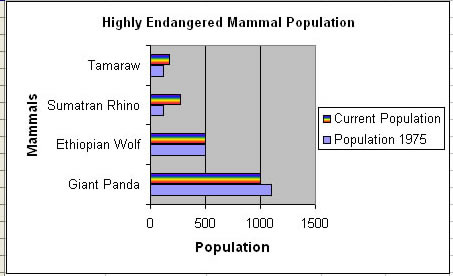
Mammal |
Population 1975 |
Current Population |
Ethiopian Wolf |
500 |
500 |
Giant Panda |
1,100 |
1,000 |
Sumatran Rhino |
120 |
275 |
Tamaraw |
120 |
175 |
- Open a blank Excel file.
- Save as “Last First Endangered Mammals"
- Enter the data from the above data table into a spreadsheet.
- Currently, the data is arranged in alphabetical order by animal name. Arrange the data in descending numerical order (click link for help) according to current population.
- Adjust column widths as needed.
- Center all data.
- Using the data in your spreadsheet, create a bar graph to show a visual comparison between the mammals populations in 1975 and the current population.
- Give your spreadsheet and bar graph the title, “Highly Endangered Mammal Populations”.
- Label each axis properly.
- Change the color of each data series (see the sample)
- Change at least 3 aspect of the charts default settings (font, background colors, axis settings, etc.)
- Now create a second chart. You can use any chart type you like EXCEPT bar graphs, just as long as it shows the comparable data clearly.
- Turn into the INBOX
Example